Friendly ID and Group are used when you want to refer to the section column in a User Driven Event.

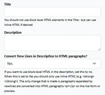
Title : A H3 level heading will be created providing the title of the section column. Only inline HTML should be used.
Description : Provide instructions or context for the fields within the section column. You may use block-level HTML here. Note that the HTML will be "tidied".
Convert to HTML : This will convert a plaintext description into HTML paragraphs. If you use HTML in the description, set this to No.
Description : Provide instructions or context for the fields within the section column. You may use block-level HTML here. Note that the HTML will be "tidied".
Convert to HTML : This will convert a plaintext description into HTML paragraphs. If you use HTML in the description, set this to No.

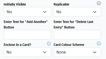
Initially Visible? : Should this section column be #visible# on initial form load?
Replicable? : Should this section column be #replicable#? If so, optionally provide the labels of the Add and Delete buttons.
Enclose in a Card? : Style the section column as a Bootstrap Card with optional colour-coding.
Replicable? : Should this section column be #replicable#? If so, optionally provide the labels of the Add and Delete buttons.
Enclose in a Card? : Style the section column as a Bootstrap Card with optional colour-coding.

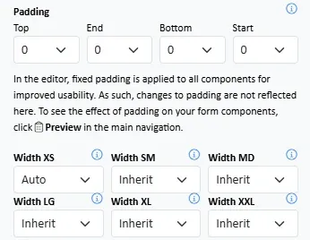
Padding : Add padding to the row container within the section column.
Width : Specify the width of the section column for each of the screen size breakpoints. It is recommended you read the article on Responsive Layout.
Width : Specify the width of the section column for each of the screen size breakpoints. It is recommended you read the article on Responsive Layout.
