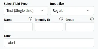
Field Type : Read the #Field Type# article
Input Size : Bootstrap supports 3 input types on single line inputs and selects
Display As: This allows you to have radio and checkbox controls displayed as buttons or as switches.
Inline Breakpoint: Radios and Checkboxes are, by default, displayed in a single column. If you want them to be displayed in a row, specify the Bootstrap breakpoint where you want this to be enforced.
Justify Inline Items : If you are allowing items to be displayed inline (in a row) specify how they should be distributed.
Wrap Inline Items: Do you want items to wrap (i.e. move to the next row) if they are too wide for the container.
Name : This is the name attribute and forms the key in key - value pair that is sent to the server on form submissions
Friendly ID and Group are used when you want to refer to the section in a User Driven Event.
Label : This is the text that is displayed above the input control on the form
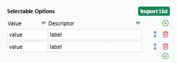
Selectable Options : A table of value-label pairs for use with select, radio and checkbox fields. Read more about managing lists.

Prepend and Append : This is where you specify input group addons. Read the article on Input Groups for more information. When you type into these fields, a search of matching Bootstrap icons will be run and the results shown underneath.
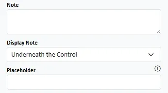
Note : Specify an explanatory note for the field.
<>strong>Display Note : You can have the note displayed underneath the input control or in a tooltip in the label.
Placeholder : The placeholder is descriptive text that is displayed inside the input control. It disappears when the input control gains focus.
<>strong>Display Note : You can have the note displayed underneath the input control or in a tooltip in the label.
Placeholder : The placeholder is descriptive text that is displayed inside the input control. It disappears when the input control gains focus.

Default Value : This is a value that will be entered into the input control (or selected from the drop down) when the form initially loads. With date, time and date-time fields you can use a formula to determine the Default value (e.g. you could set a the default value to be the current time). Autocomplete : Specify the autocomplete token you want for the field. This is a complex area and a blog post will be written soon. In the meantime, you can get more detail here.
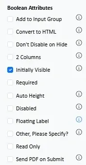


Add to Input Group : Tick this if you want to add the field to a multi-field input group (you also need to name the group using the Group field above)
Input Group Weight : Tick this if you want the input to expand to the available horizontal space in the group. Untick if you want the input retain it's "natural" width.
Auto Height : Make mutli-line fields occupy the available space in the container.
Convert to HTML : For multi-input fields (textarea) convert the user input into HTML by making plaintext paragraphs HTML paragraphs.
Disabled : Is the field initially disabled (i.e. the user cannot edit it and it will not be submitted)?
Don't Disable on HIde : By default, when a field is hidden it becomes disabled. There may be circumstances when you don't want this to happen. Note, however, that empty, enabled, hidden fields will prevent the form from being submitted without a warning
Floating Label : Is the field formatted as a Bootstrap floating label field?
Other, Please Specify : On radio, checkbox and select fields, is an "Other Please Specify" option added?
Initially Visible : Is the field visible when the form is first loaded?
Read Only : Is the field initally read only? It cannot be edited but its content will be sumbitted.
Required : Is a response to this field required?
Send PDF : For email fields, and on hosted forms, will the provided email address receive a PDF version of the form on submission?

Height : If a multi-input field has auto-height then this will be the minimum height of the input. If not, it will be the height. You can click the button to get the height from the form.
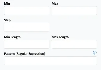
Min and Max : Set the minimum and maximum values that are allowed. With date, time and date-time fields you can use a formula to determine the Min and Max values (e.g. you could set a min value to be ""today" or "today minus 7 days").
Step : Specify the allowed increments. For date-time fields this value is measured in seconds.
Min Length and Max Length : Set the minimum and maximum length of input (number of characters) allowed in the input
Pattern : Specify a regular expression that the input must match
#Read more about Validation#
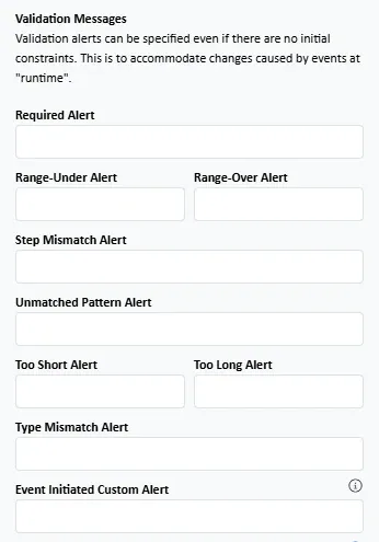
Required Alert : A message that will be displayed on submission if a required field is not completed
Range Under / Range Over : A message that will be displayed on submission if the field input does not comply with the min and/or max requirements
Step Mismatch : A message that will be displayed on submission if the field input does not comply with the step requirements
Unmatched Pattern : A message that will be displayed on submission if the field input does not match the regular expression
Too Short / Too Long : A message that will be displayed on submission if the field input does not comply with the minimum length and/or maximum length requirements
Type Mismatch : If the input does not match the required type e.g. if an email is expected but a non-email is input.
Event Initiated Custom Alert : If a user driven event determines that an input is invalid, this message will be displayed.

Margin : Add spacing around the field. The bottom margin defaults to 2. You may want to set this to 0 on the last field in the container.
