All formstrap components (except fields) can be displayed as a Bootstrap Card.
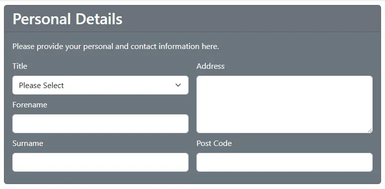
Cards allow you to highlight form sections and enclose their contents in a border with a stylised header.
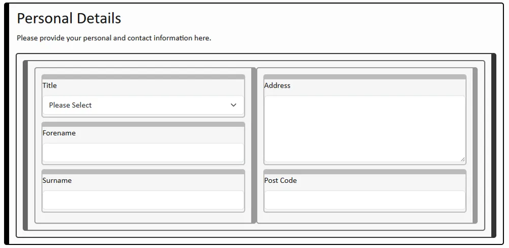
This simple, two column form has a title and a description set in the Section component. This is what it looks like in the editor. 
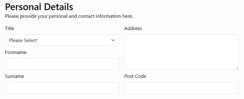
When the form is previewed it looks like this: 
This video shows how to change the setting so that the section is enclosed in a Bootstrap style card. The yellow circles indicate a context click (e.g. right mouse button). The green circles indicate a main click (e.g. left mouse button).
After the change, the preview now looks like this: 
Colour Coding
The following colour schemes are supported. More will follow.
Nesting Cards
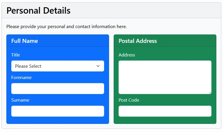
You can nest cards e.g. this image shows a form with a Section Card (Personal Details) that contains 2 Section Column Cards - one for the Full Name (colour-coded with "Primary") and the other for the Postal Address (colour-coded with "Success"). 
