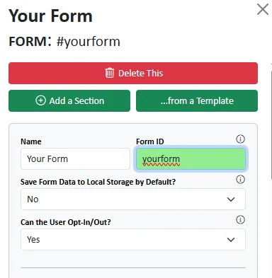
There are some form settings that you must set up before you can publish your form and it makes sense to do some of these before you start building the grid.
Form ID

Your form will have an ID of yourform. If you intend to publish multiple forms on the same page, each MUST have a unique ID otherwise you will receive browser console errors due to duplicated IDs.
Container Widths - Responsive Design
Form Container
By default the form width is set as follows.
| Screen Width | Width |
|---|---|
| Extra Small | 12 |
| Small | 11 |
| Medium | 10 |
| Large | 9 |
| Extra Large | 8 |
| Extra-extra Large | 6 |
The #Boostrap grid# is broken up into 12 equal parts - so if the width is 12 then the form will occupy the full width of the container.
Let's assume for simplicity that the form container is the <body>.
This would mean on a small mobile device, the form will occupy the full width of the screen (12/12*100) but on a super-wide monitor the form will use up 50% of the screen (6/12*100).
If you are unfamiliar with Bootstrap's responsive break points, please read Bootstrap's Breakpoint Page.
Logo and Form Title and Description
Within the form container there is a container for the logo and another for the form title and description.
Each of these also have defaults that should work reasonably well on most devices.
Logo Container
| Screen Width | Width |
|---|---|
| Extra Small | 8 |
| Small | 6 |
| Medium | 3 |
| Large | 2 |
| Extra Large | 1 |
| Extra-extra Large | 1 |
Title and Description Container
| Screen Width | Width |
|---|---|
| Extra Small | 12 |
| Small | 12 |
| Medium | 9 |
| Large | 10 |
| Extra Large | 11 |
| Extra-extra Large | 11 |
Note that the above widths are a proportion of the form container (not the body).
Using the values above, on a Medium screen:
- the Form would occupy 10/12*100 = 83.34% of the width of the screen.
- The Logo would occcupy 3/12*100 = 25% of the formcontainer.
- The Title and Description would occupy 9/12*100 = 75% of the formcontainer.
Because the total width of the logo container and the text container is <=100% these containers will be displayed as columns in a single row.
However on a Small screen:
- the Form would occupy 11/12*100 = 91.67% of the width of the screen.
- The Logo would occcupy 6/12*100 = 50% of the formcontainer.
- The Title and Description would occupy 12/12*100 = 100% of the formcontainer.
Because the total width of the logo container and the text container is >100% these containers will be stacked as there isn't room in the row to display them as columns.
Watch this video which illustrates this point.
Self Hosting URLs
If you are self-hosting you must provide the following URLs
- URL to Receive Form POST Data
This will be a server side script that can process and store the form data when it is submitted - URL for Success Redirect
If the data processing URL confirms the data has been successfully processed, the user will be redirected to this URL - URL for Failure Redirect
If the data processing URL confirms that the data has not/could not be processed, the user will be redirected to this URL
You can't download your self-hosted package until these details have been provided. If you try to publish for self-hosting, you will be prompted to complete these fields.
If formstrap is hosting your forms you can leave these blank.
