formstrap supports applying spacing around and within the various containers as follows:
| Container Type | Margins | Padding | Gutters | Justify |
|---|---|---|---|---|
| Section | ||||
| Section Column | ||||
| Row | ||||
| Column | ||||
| Field |
Spacing
You can specify the different spacings on a scale of 0-5. For specific information about how these values equate to measurements please read the Bootstrap spacing page.
For simplicity, "default" means Bootstrap's default spacing, 0 means no spacing and 5 is the maximum spacing allowed.
Margins
Margins are space added around a container.
This image shows a form with 2 Sections. The first Section has a margin of 5 on each side. 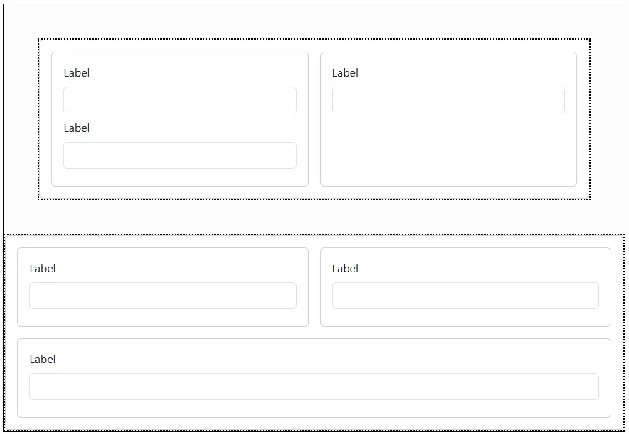
Note that adjacent margins collapse into a single margin so if you have a bottom margin of 5 on the first section and a top margin of 5 on the second section - the total effective margin is 5. If the margins are different sizes the largest margin is used. In the image below both sections have margins of 5 all around. 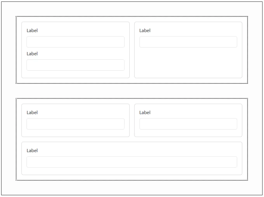
This image shows a bottom margin of 3 on the first Field in the first Column. Compare this with the fields in the second Column which have zero margins. 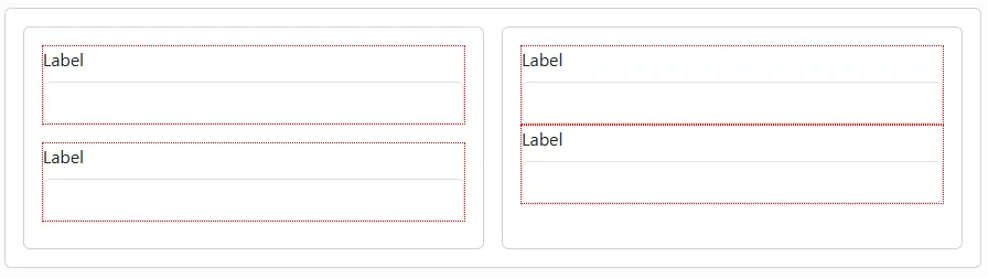
Padding
Padding is space inside a container.
Note that padding is not shown in the editor - so you need to preview or publish the form to see the effect of padding.
This image shows padding of 3 on all sides in the first Column. The column has a blue dotted border so the effect is clearer. The padding has no effect on the spacing between the fields. Compare the effect with the second column with no padding.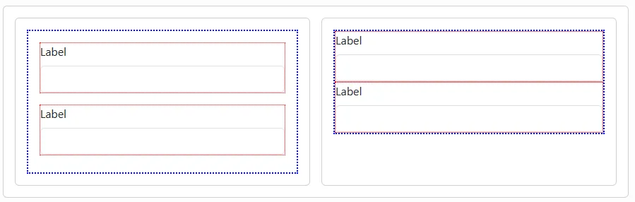
Gutters
Gutters create space between sibling containers (but not outside them).
Note that the effect of gutters is not shown in the editor. Use preview or publish to see the gutters in action.
In this image, the form has 3 Section Columns. 2 of these have a width of 6 (i.e. 50% of the container width) and the third has a width of 12 (i.e. 100% of container width). Please read the article on Responsive Layout if this is unfamiliar territory.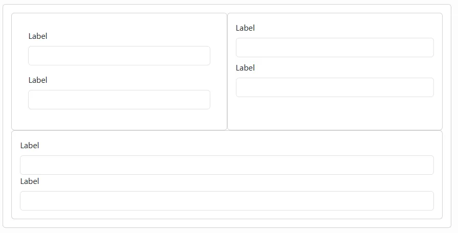
Because the total width is greater than the available space, the third column is shown underneath the first two.
The Section has been set to have gutters of 0. This is why the 3 Section Columns have no space between them.
Setting the horizonal gutter to 5 and the vertical gutter to 3 results in a form that looks like this: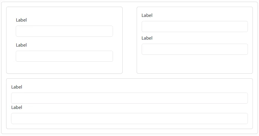
Note how the gutter only affects the internal spacing BETWEEN components - not around them.
Justify
You can specify Bootstrap justification settings on Sections and Rows. This will determine how the Section Columns and Columns within them are distributed.
For example you might have 3 Columns in a Row that have widths that mean they don't fill the full width of the container. Justify allows you, for example, to display these in the centre of the row or distribute them in other ways.
There are six justification types:
- Start
- Centre
- End
- About
- Between
- Evenly
Watch this video to see how the different justification types affect the layout.
